
Check Out
Check out is the most important process on a e-commerce website both for the buyer and the seller and that why the process needs to be simple and user frendily. As found in research that cart abandonment is at a high rate, users leave the checkout process because it is complex to use and this results in users not buying from the website. From a survey conducted by me it was found out that 10 out of 20 people abadon their cart at checkout on a e-commerce website, due to it being complex and hard to use.
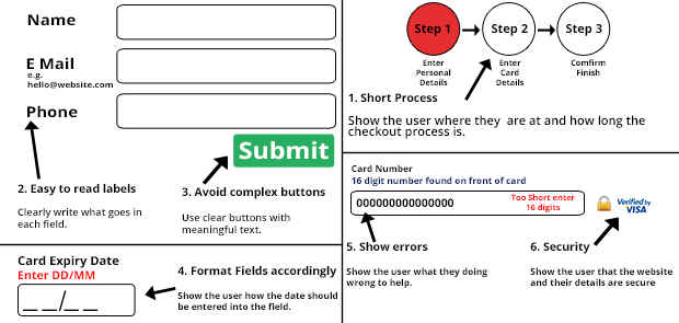
Apply these features

1. Short Process
Long checkout process and entering information over and over again makes the user leaving a e-commerce website. So keep the checkout process short and take only the required information, this way the user will not have to spend a lot of time trying to buy products. One way is to show the user the steps, can have a 123 step process where it is shown on the top of the page, where the user can see and interact.
2. Easy to read labels
Explain each field to the user and show a example of the input type for example Date of Birth - (dd/mm/yyyy). If the labels are not easy to read then you will confuse the user, which normally results in them purchasing elsewhere.
3. Avoid complex buttons
Provide the user with simple buttons such as next, buy it now and next step. Avoid buttons such as continue as users may get confused and press it to continue shopping instead of them checking out. Use buttons such as Pay now, Buy now, Complete transaction.
4. Format the fields accordingly to the data
Format the fields according to the information, for example expiry date of a debit card should be formated as on the card, which normally is mm/yy. Having incorrect formatted fields can cause a problem for the user and this will result in loss of sales and consumers leaving the website. Also limit the fields and use the new features that are available with HTML 5.
5. Clearly show errors
Always clearly show what errors have happened during the use of the checkout, not telling the users what they have entered wrong can cause a lot of hassle afterwards and cause a huge problem for the business. Show the user what they entered wrongly with a red box for example and show them a example of what goes in the field.
6. Security
Security is a very important feature when using a e-commerce website. It is important to show the user what security features are in place to protect the user, if you havent got any security or verifications then the trust of the website will be lost and users will shop elsewhere.
- Examples of Good Checkout

Amazon provide their users with an excellent user experience. They show the user how long the process is and what is next in the checkout process.
