Call to Action?
Call to action is very important on website and they help to increase the experience the user gets. It allows you to direct the user to something that they need to do like clicking a button that says "shop now". Examples of this are on the H&M website, they have a large slideshow with images of their products and a large button that says "Shop Now", this is to get the attention of the user.
Make it catch the eye
Think about the size, color and make sure it will draw the attention of the user.

Bright colors really make the button stand out and these colors are available from the Flat UI Kit from bootstrap.
Make it clear
Use Dynamic words, such as "Buy now", "Donate Now" and "View Sale" etc.

Use White Space
Use white space around the button, this will help to keep the button detached from other elements on the page. White space adds power to your website and the elements on the page.
Allow the user to click
Make a button that stands out to the user, so they can click on it and follow to what they need. Use bright colors for buttons to make them stand out.
-Good Example of CTA
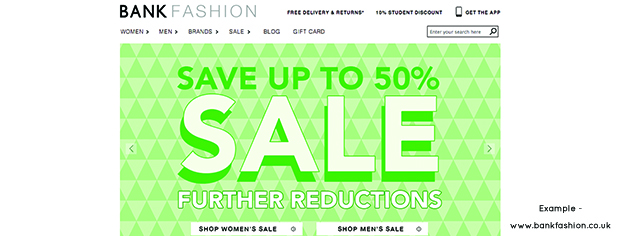
Bank website uses many call to action buttons, which are shown above. The main call to action is the 2 big buttons that direct the user straight to the sale section. As found out from surveys and research that users tend to click on the big and eye catching buttons.
